
Figure 4 |. Assembly and representation of a network model.
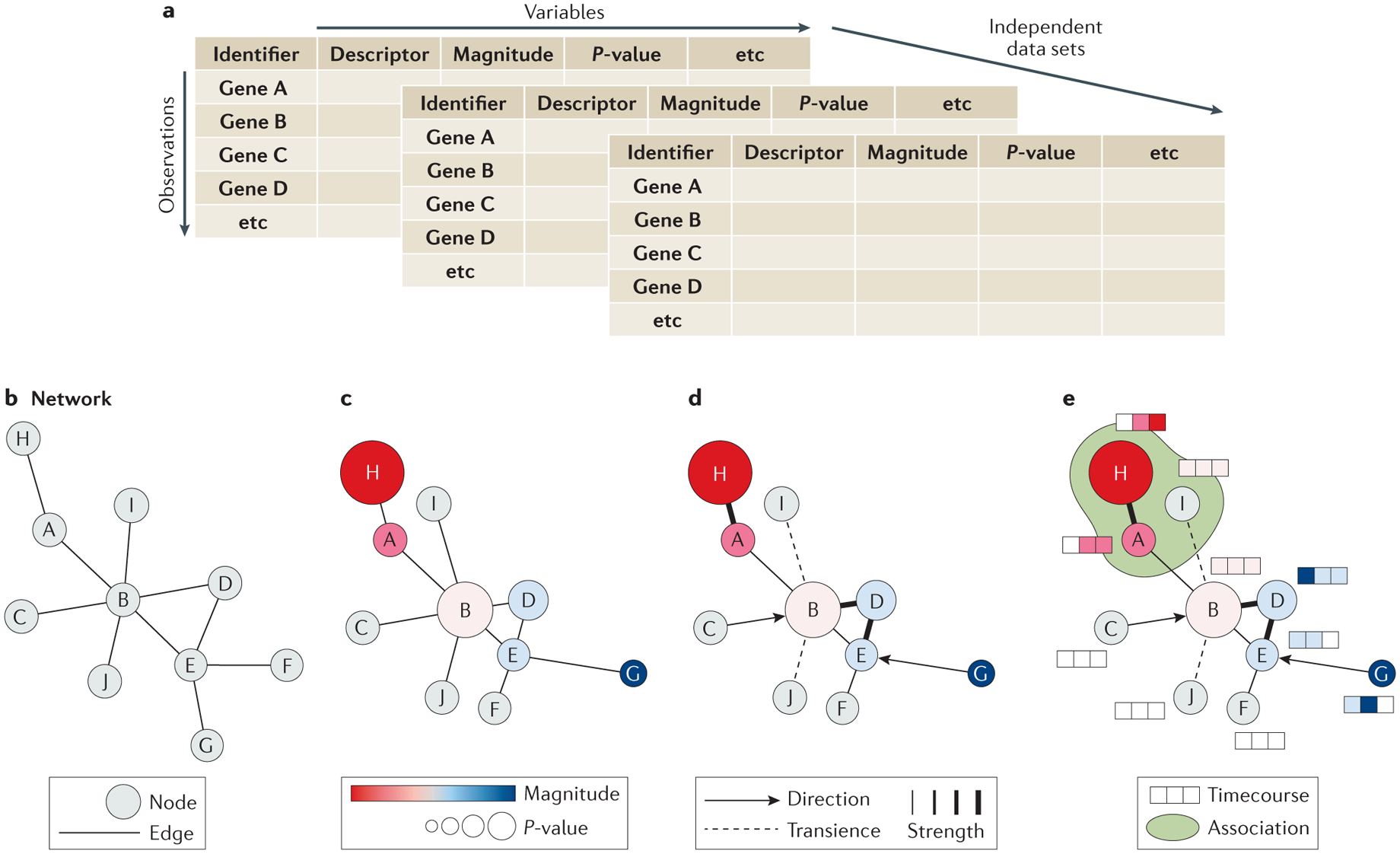
After the organization of the collected data into a tidy format (a), a simple network of nodes and edges can be assembled (b) with each node representing a component of the system and each edge representing their relationships. Varying the size, color, and organization of the nodes can be used to add dimension to the dataset by visualizing magnitude, p-value, or a common descriptor (c). Additional information can be depicted by varying edge characters such as width to indicate associative strength, gaps to indicate transience, or arrows to indicate directionality (d). Different types of data may benefit from different methods of depiction to complement the base network, including heatmaps to illustrate timecourse data or shading to illustrate pathway or complex membership (E).