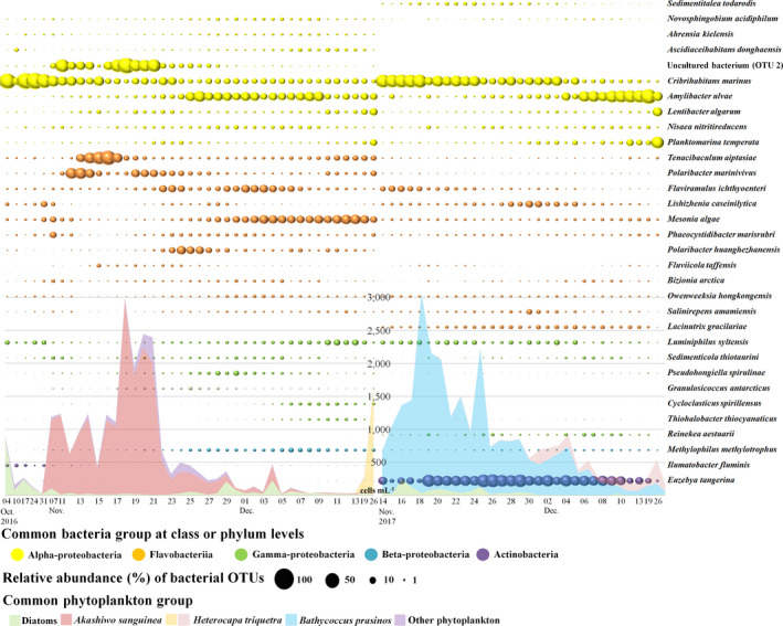
FIGURE 3.

Time‐series circle plot showing the most abundant bacterial operational taxonomic units (OTUs) (each displaying a relative abundance > 1% in at least one sample) in 2016 and 2017. The colours in the circle plots correspond to the common bacterial groups. The coloured areas correspond to the common phytoplankton groups in 2016 and 2017. To show the differences in relative abundance for the displayed OTUs, the circle is on a 0–100 scale representing relative abundance (%)
