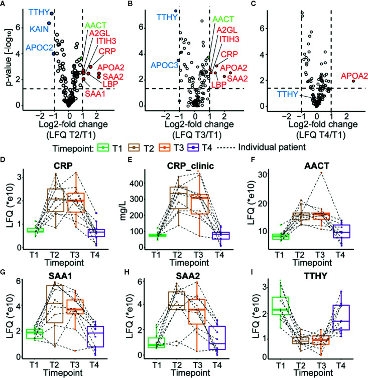
Figure 2.
Plasma proteome profiles of septic patients. Volcano plots depicting the changes in protein abundances, normalized against T1, for T2 in (A), T3 in (B), and T4 in (C) averaged over all ten patients. Proteins increasing in abundance are depicted in red, while proteins becoming lower in abundance are shown in blue. AACT is depicted in green. Dotted lines indicate thresholds for significance and fold change. (D) Proteomics based quantitation of CRP levels per individual patient. (E) CRP levels measured in the clinic. (F) Proteomics based quantitation of AACT per individual patient. Proteomics based abundance levels for SAA1, SAA2, and TTHY in all individual patients are depicted in (G–I), respectively. The depicted boxplots contain data for all patients across all four time-points. The dashed lines connect for each individual patient its corresponding time-points.

