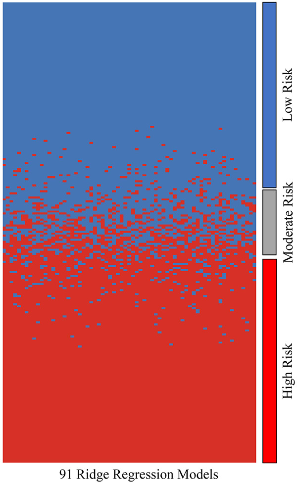
Figure 2.

Heat map comparing how each model (columns) ranked each patient in terms of risk (high or low). For the most part, each model agreed on whether patients were low or high risk. If there was greater than 25% disagreement between all models on whether a patient was high or low risk, that patient was categorized as moderate risk. Patients were ordered by the percentage of votes for the high risk group (red color).
