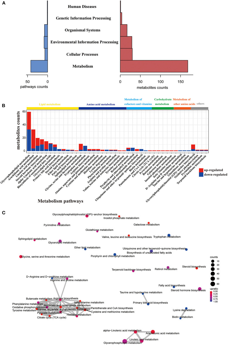
Figure 2.
Pathway analysis of different metabolites. (A) Histogram of the holistic matching. All different metabolites are enriched into seven categories. The left blue bar indicates the number of enriched pathways. The right red bar indicates the number of covered metabolites. (B) Bar chart showing the number of metabolites covered by each enriched pathway. The y-axis indicates the number of metabolites while the x-axis indicates the pathway name. Red: increased; blue: decreased. The class of each pathway was labeled by the color bar on the top. (C) The network of enriched pathways. Each pathway is represented by a dot. Red: the ratio of the up-regulated metabolites is higher than down-regulated metabolites; blue: the ratio of down-regulated metabolites is higher than up-regulated metabolites. The dot size indicates the number of metabolites in the corresponding pathway. The line thickness represents the amount of substances shared by the linked pathways; the coarser, the more metabolites.

