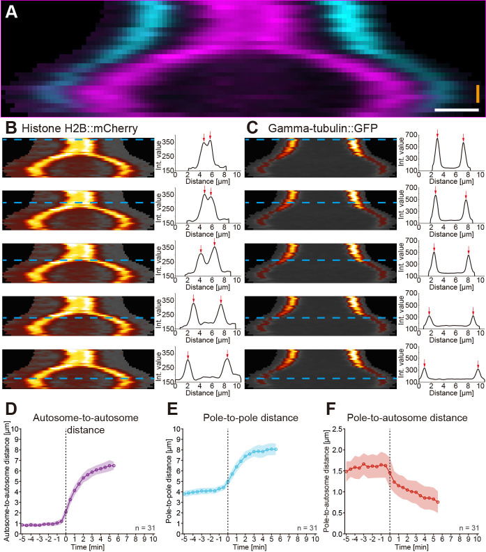
Figure 4. Kymographic analysis of spindle dynamics.
A. Dual-color kymograph for the spindle as presented and processed in Figure 3. Autosomes are shown in magenta and spindle poles in cyan. Scale bar (white), 1 µm, time bar (orange), 2 min. B. Analysis of autosome dynamics. The kymograph of the histone::mCherry channel with the individual time points indicated by blue dashed lines is shown on the left, the fluorescence intensity profiles with highlighted the two peak intensities (red) arrows on the right. C. Analysis of spindle pole movements. The kymograph of the γ-tubulin::GFP channel (left) and the fluorescence intensity profiles are shown (right). D. Analysis of the autosome-to-autosome distance over time for 31 data sets aligned at anaphase onset (t0). Circles represent the mean, shaded area the standard deviation. All mean values are connected by a solid line. E. Analysis of the pole-to-pole distance over time for 31 data sets. F. Analysis of the pole-to-autosome distance over time for 31 data sets.

