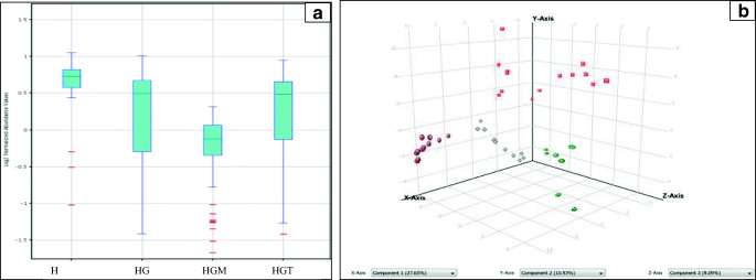
Fig. 3.
a The box-and-whisker plot showing distribution of metabolites in healthy (H), hypertriglyceridemic (HG), and metformin treated (HGM), and TCE treated (HGT) groups of hypertriglyceridemic patients. b PCA plot of metabolic variables in samples where brown dots indicates healthy (H) population, red squares indicates hypertriglyceridemic (HG) population, grey squares indicates metformin treated hypertriglyceridemic (HGM) population, and green circles indicates TCE treated hypertriglyceridemic (HGT) population

