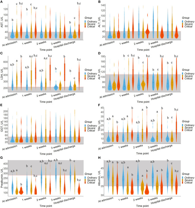
Figure 1.
Timeline charts illustrate dynamic changes of liver biomarkers. The box in the violin plot represents the median and quartile, the extension from the thin black line represents the 95% confidence interval, and the width of the violin plot represents the sample size at this level. In addition, the normal range was defined and drawn as gray area. a represents the significant difference between the ordinary and severe groups after Bonferroni correction. b represents the significant difference between ordinary and critical group after Bonferroni correction. c represents the significant difference between severe and critical group after Bonferroni correction. (A) AST. (B) ALT. (C) LDH. (D) ALP. (E) GGT. (F) TBiL. (G) Prealbumin. (H) Albumin.

