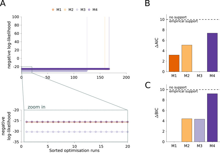
Fig. 4.
Analysis of model structure. (A) Waterfall plots for the 200 multi-start runs. The optimization runs are sorted by increasing negative log-likelihood value. The lower panel shows a magnification of the best 20 starts. (B) Differences in AIC with respect to the lowest value indicate M3 as the most plausible model. (C) Differences in BIC with respect to the lowest value indicate M1 as the most plausible model. Black dashed line in (B) and (C) depicts a change of 10 units considered as a rejection threshold (Burnham and Anderson, 2002).

