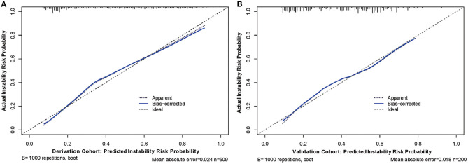
Figure 3.
Calibration curves of the nomogram model with derivation (A) and validation (B) cohorts, respectively. Calibration curves depict the calibration of predictive model in terms of the agreement between the predicted risk of aneurysm instability and observed actual status of aneurysm stability. The y axis represents the actual status of aneurysm stability. The x axis represents the predicted probability of instability. The diagonal dotted line represents a perfect prediction by an ideal model. The blue solid line represents the performance of the nomogram, of which a closer fit to the diagonal line represents a better prediction.

