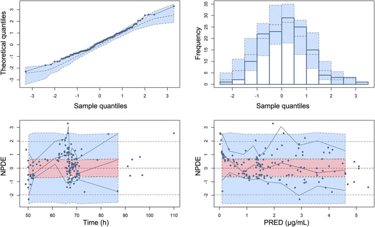
FIGURE 6.
Normalized prediction distribution errors (NPDE) of the final population pharmacokinetic model. (A) Quantile–quantile plot of NPDE vs. the expected standard normal distribution, (B) histogram of NPDE with the density of the standard normal distribution overlaid, (C) Scatterplot of NPDE vs. time, and (D) scatterplot of NPDE vs. PRED. Blue dots represent observed concentrations. Red lines show the medians of observed data and blue lines show the 5th and 95th percentiles of observed concentrations. Red or blue shaded areas represent the 95% prediction interval for the respective metric.

