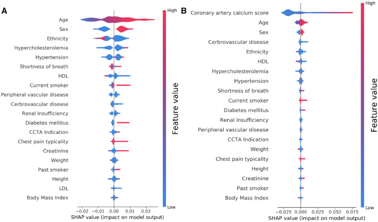
Figure 2.
Feature importance plot for the (A) machine learning model and (B) machine learning model with coronary artery calcium score. The top 20 clinical variables are shown in this figure. The blue and red points in each row represent participants having low to high values of the specific variable, while the x-axis gives the SHAP value which gives the impact on the model [i.e. does it tend to drive the predictions towards event (positive value of SHAP) or non-event (negative value of SHAP)]. SHAP, Shapley Additive Explanation values.

