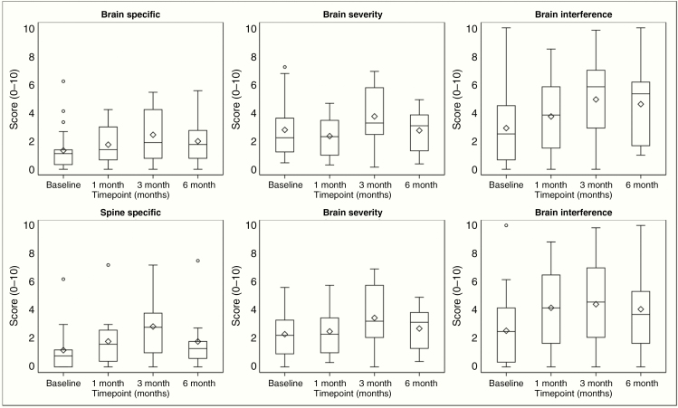
Figure 3.
MDASI score distribution overtime. These plots are a schematic for the distribution of values. The ends of the box represent the 25th and 75th percentiles (or 1st and 3rd quartiles), while the center line and diamond represent the median and mean, respectively. The 75th minus the 25th percentile equals the interquartile range (IQR), and the ends of the whiskers are placed at 1.5 times the IQR. Any values lying outside these boundaries are considered outliers. Higher values indicate worsening symptoms.

