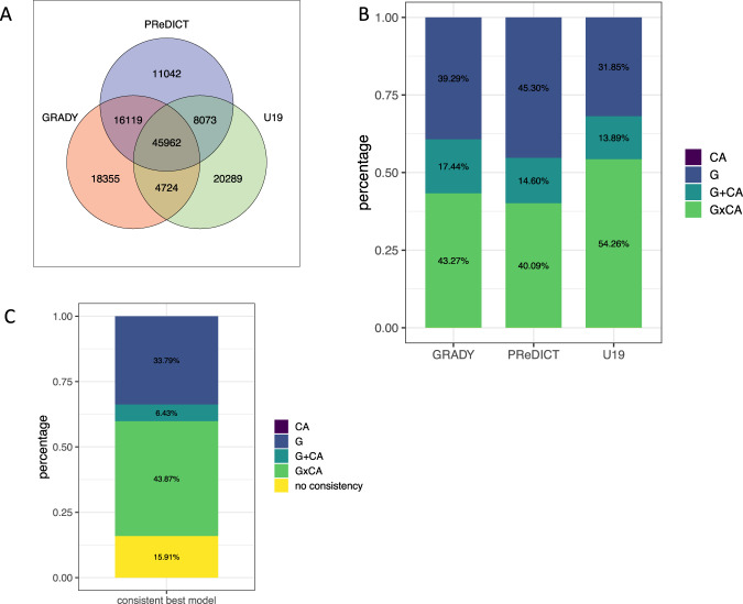
Fig. 1. Overlapping VMPs between GRADY, PReDICT, and U19.
Venn diagram of overlapping VMPs for GRADY, PReDICT, and U19 at a MAD score threshold at the 80th percentile (a). Distribution of the best models explaining variation in DNAm across the three adult cohorts. Percentage of overlapping VMPs (n = 45,962) best explained by G, CA, G + CA, or G × CA in each cohort using the highest adjusted R2 (b). Consistent best models across three adult cohorts. Percentage of overlapping VMPs (n = 45,962) best explained by the same model type (G, CA, G + CA, or G × CA) in at least two cohorts (c).

