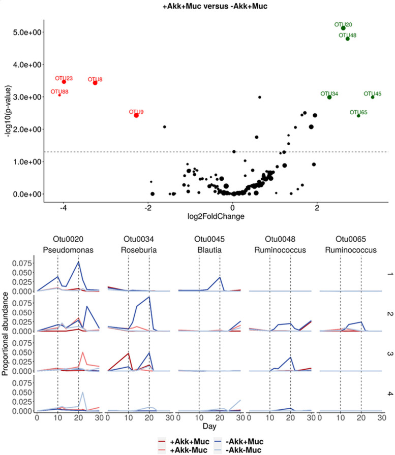
FIG 7.
(Top) Volcano plot showing results from the DESeq2 analysis between treatments +Akk+Muc and –Akk+Muc in donor 2. Green and red dots represent OTUs that are more abundant in –Akk+Muc and +Akk+Muc, respectively, and the size indicates the relative abundance of the OTU in the community. (Bottom) Relative abundance of OTUs stimulated by mucin treatment –Akk+Muc in donor 2. As a comparison, relative abundances for the other donors are shown too.

