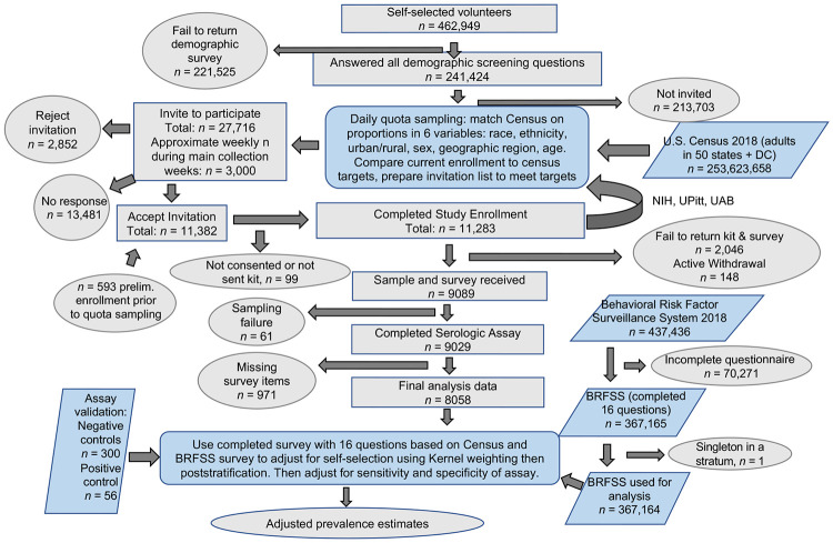
Figure 1: Serosurvey overview and statistical workflow.
A flow chart of donor recruitment through data analysis displaying steps in data acquisition and any attrition from data sets if applicable. Key: Ovals = starts and ends, gray rectangles = subsets of participants in this study, blue parallelograms = individuals from outside data sets that contribute to adjusted prevalence estimates, blue rounded rectangles = analysis processes.

