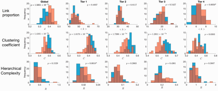
Figure 2.
Histograms of network metrics of SLE structural connectomes (orange) and healthy controls (blue). The first left-hand side column shows global metric values and subsequent columns show tier metric values. The first plot in the top row shows the global network density, d, from the unthresholded networks, since global average degree is fixed by the threshold. Average degree, <k>, is shown subsequently in the other columns of the top row for individual tiers. The second row shows global and tier-specific clustering coefficent, C, and the third row shows global and tier-specific hierarchical complexity, R.

