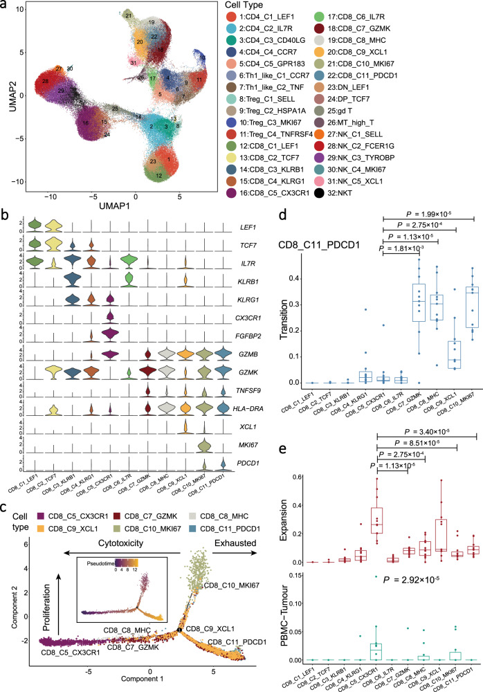
Fig. 2. Expression profile and development of CD8+ T cells.
a UMAP plot of 141,875 T and NK cells grouped into 32 cell types. Each dot represents a cell, coloured according to the cell types indicated at the right legend. b Violin plots showed the normalised expression of CD8+ T cell markers (rows) in each CD8+ T cell cluster (columns). Cell clusters and the expression level of a gene are indicated at the x- and y-axis, respectively. c Pseudotime trajectory analysis of selected CD8+ T cells (CD8_C5, CD8_C7, CD8_C8, CD8_C9, CD8_C10, and CD8_C11; n = 10,000) with high variable genes. Each dot represents one single cell, coloured according to its cluster label. The inlet plot showed each cell with a pseudotime score from dark blue to yellow, indicating early and terminal states, respectively. For CD8+ T cell clusters, 10,000 cells were randomly selected for the analysis. d Box plots showed the transition-index scores of exhausted CD8+ T cells (CD8_C11_PDCD1) and other CD8+ T cells (n = 10). Comparison was made using a two-sided Wilcoxon test. Cell clusters and transition-index scores are indicated at the x- and y-axis, respectively. Endpoints depict minimum and maximum values; centre lines denote median values; whiskers denote 1.5× the interquartile range; coloured dots denote each patient. e Box plots showed the expansion- (top panel) and PBMC-Tumour migration-index (bottom panel) scores of each CD8+ T cell cluster (n = 10). Each comparison was made using either a two-sided Wilcoxon test (top panel) or Kruskal–Wallis test (bottom panel). Cell clusters are indicated at the x-axis, and the y-axis shows the expansion- and PBMC-Tumour migration-index scores at the top and bottom panel, respectively. Endpoints depict minimum and maximum values; centre lines denote median values; whiskers denote 1.5× the interquartile range; coloured dots denote each patient.

