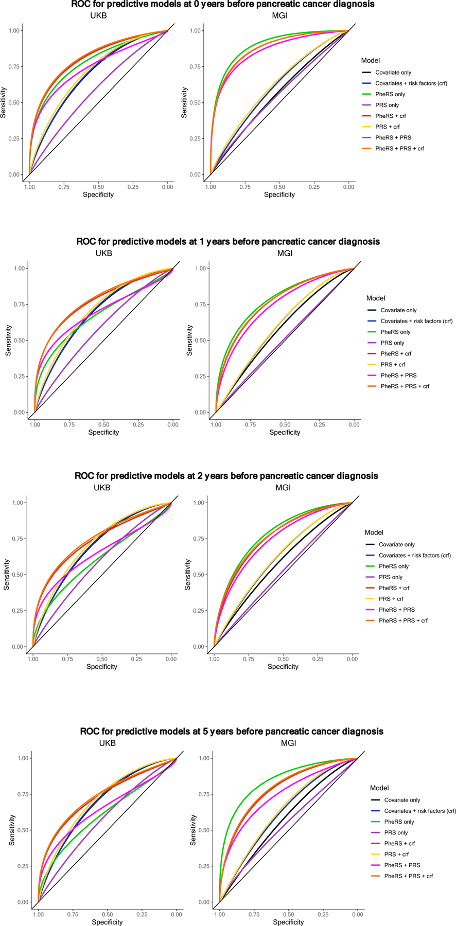
Figure 3.

AUC plot comparing model cascade
a. AUC curves by model in MGI (left) and UKB (right) at 0 years before pancreatic cancer diagnosis threshold. Corresponding AUC and 95% CI values for UKB and MGI can be found in Table 4.
b. AUC curves by model in MGI (left) and UKB (right) at 1 year before pancreatic cancer diagnosis threshold. Corresponding AUC and 95% CI values for UKB and MGI can be found in Table 4.
c. AUC curves by model in MGI (left) and UKB (right) at 2 years before pancreatic cancer diagnosis threshold. Corresponding AUC and 95% CI values for UKB and MGI can be found in Table 4.
d. AUC curves by model in MGI (left) and UKB (right) at 5 years before pancreatic cancer diagnosis threshold. Corresponding AUC and 95% CI values for UKB and MGI can be found in Table 4.
