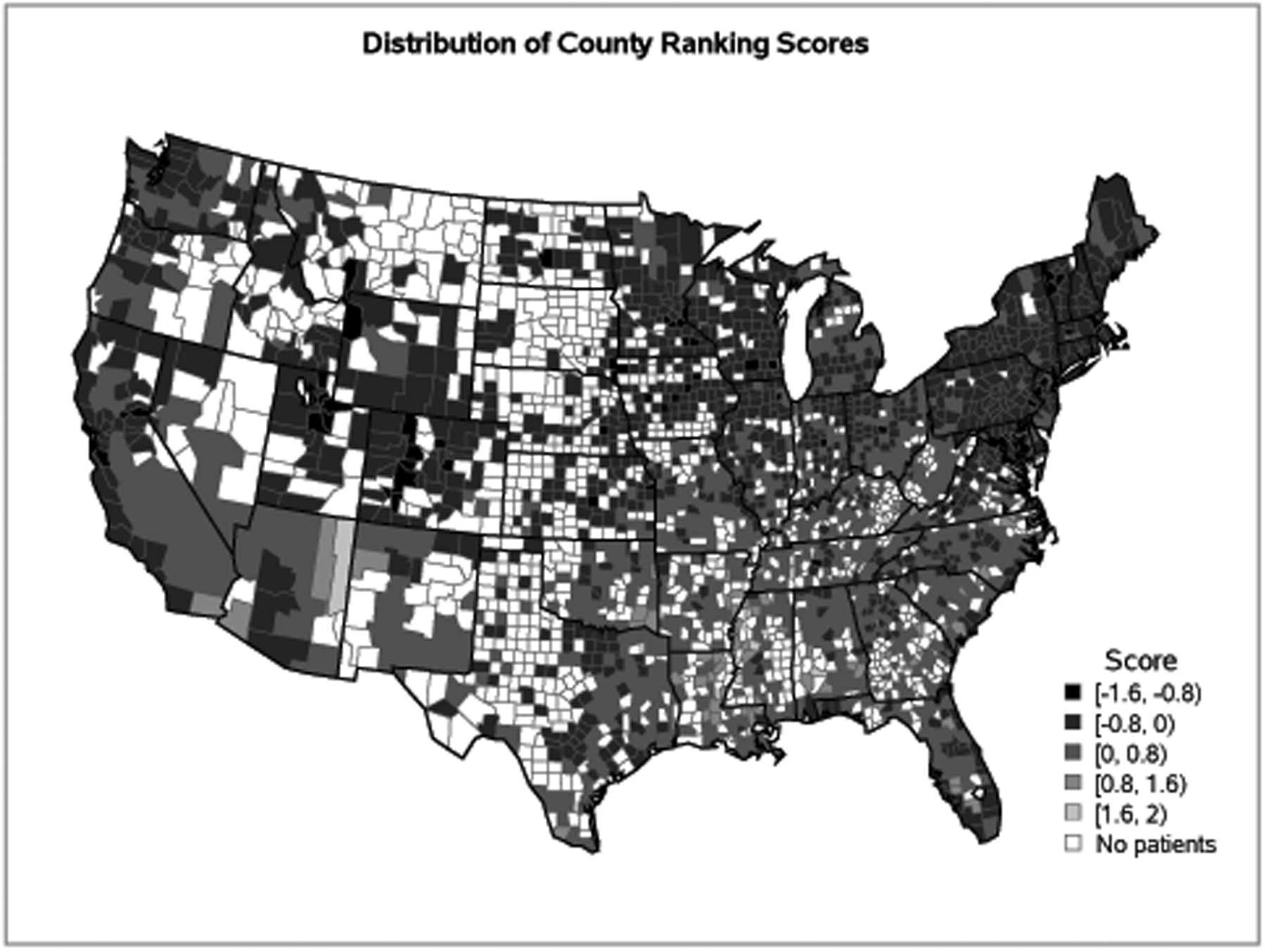
Figure 2. Map of County Ranking Scores on Adult Allogeneic Transplant Patient Residence in the United States.

*Note: Lower scores, represented by lighter grey colors, are better health factor rankings, while higher scores, represented by darker grey colors, are worse health factor rankings. White areas did not have transplant recipients.
