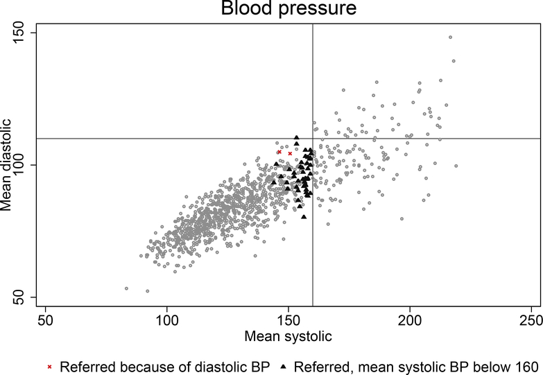
Figure 2: Blood pressure of respondents of the 2013 MLSFH survey.
Notes: The graphs shows average of the three measures of systolic and diastolic blood pressure for respondents of the 2013 MLSFH-MAC survey. Dots represents mean values of systolic (x-axis) and diastolic (y-axis) blood pressure. Small triangles represent individuals whose maximum systolic blood pressure is at least 160 but their mean systolic blood pressure is below 160. Small red x represent the individuals who were given a referral letter because their diastolic blood pressure is at least 110.

