
FIGURE 3.
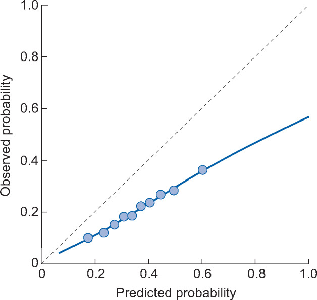
Example of a calibration plot. The dotted line at 45 degrees indicates perfect calibration, as predicted and observed probabilities are equal. The 10 dots represent tenths of the population divided based on predicted probability. The 10% of patients with the lowest predicted probability are grouped together. Within this group the average predicted risk and proportion of patients who experience the outcome (observed probability) are computed. This is repeated for subsequent tenths of the patient population. The blue line is a smoothed lowess line. For a logistic model this is computed by plotting each patient individually according to their predicted probability and outcome (0 or 1) and plotting a flexible averaged line based on these points. In this example calibration plot we can see that the model overpredicts risk; when the predicted risk is 60%, the observed risk is ∼35%. This overprediction is more extreme for the high-risk x-axis. If a prediction model has suggested cut-off points for risk groups, then we recommend plotting these various risk groups in the calibration plot (instead of tenths of the population).