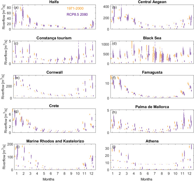
Figure 7.
Bar graphs of simulated mean monthly flow (m3/s) for three catchments at each selected incident sites (see Fig. 1b for location). Orange colours represent discharge for a current time horizon (1971–2000). The indigo coloured bars represent discharge for a 30-year time horizon in the future, centered on 2080 following the RCP8.5 emission scenario. Most locations represented in this figure record a drier summer half-year compared to the winter half-year (November to March). Estimates of future change indicate much uncertainty, sometimes indicating that both decreases and increases are plausible futures. Graphs suggest a drying signal in the east of Mediterranean, particularly clear for Haifa and Famagusta. Further to the west and north, the change-pattern in catchment river flow is largely reversed, with increases more likely in the wetter winter months.

