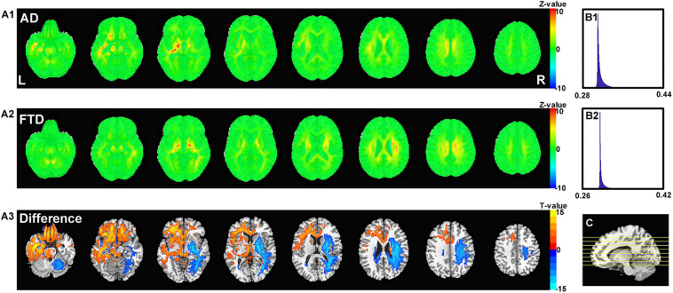
FIGURE 6.
The calculated unique contribution graphs of each disease. (A1) the mean contribution in each voxel of all AD subjects. (A2) the mean contribution in each voxel of all FTD subjects. Both (A1,A2) showed Z-value. (A3) the AD-FTD difference of the contribution maps, here showing T-value of two sample t-test and regions have p < 0.0001. (B1) the histography of the mean contribution of AD group. (B2) the histography of the mean contribution of FTD group. (C) the location of the axial slices shown in (A1–A3).

