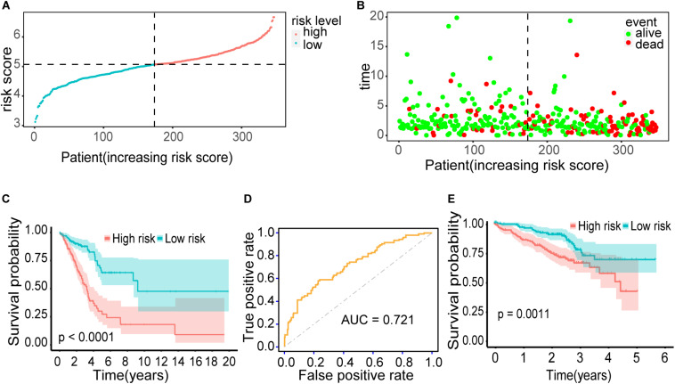
FIGURE 6.
Outcomes of the prediction model. (A) The distribution of risk scores for 345 early-stage LUAD patients. (B) The distribution of survival status, sorted by risk score. (C) Kaplan–Meier survival curve. It demonstrated the survival difference between the high-risk group and low-risk group. (D) ROC curve. It showed the performance of the model. (E) Kaplan–Meier survival curve using the validation cohort. Patients with higher risk score exhibited worse overall survival.

