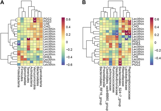
FIGURE 9.
Heat map of the correlation between metabolites and intestinal bacteria (n = 3). (A) shows a heat map of intestinal bacteria and differential metabolites at the phylum level, and (B) shows a heat map of intestinal bacteria and differential metabolites at the family level. The horizontal axis is intestinal bacteria, and the vertical axis is metabolites. Each grid represents the correlation coefficient between intestinal bacteria and metabolites. The color changes from white to red, indicating the positive correlation is from weak to strong; from white to blue indicates the negative correlation is from weak to strong. “*” means significant correlation (p < 0.05); “**” means extremely significant correlation (p < 0.01).

