FIGURE 2.

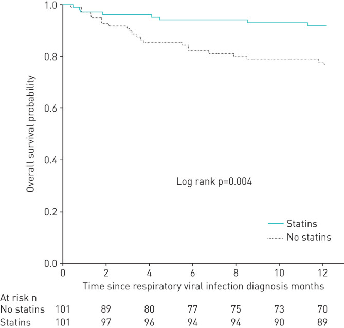
Kaplan–Meier survival curves showing the differences in all-cause death in matched population. Continuous line represents statin users. Dashed line represents non-statin users.

Kaplan–Meier survival curves showing the differences in all-cause death in matched population. Continuous line represents statin users. Dashed line represents non-statin users.