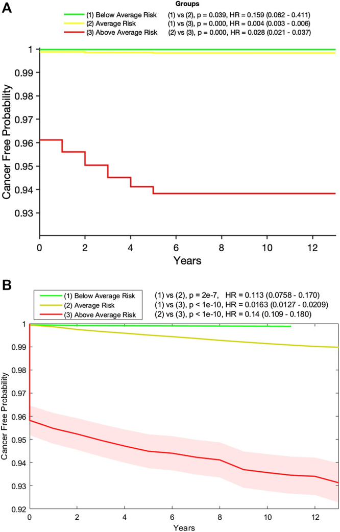
FIGURE 3.

(A) Kaplan-Meier plot of the below- (green), at- (yellow), and above- (red) average risk groups created from the testing data by our random forest model. Also shown are the p-value and hazard ratio (HR) between each group. Those in the above-average risk group clearly have the highest chance of developing cancer and (B) Kaplan-Meier plot of the below- (green), at- (yellow), and above- (red) average risk groups created from the testing data by our neural network model with 95% confidence intervals (shaded). Also shown are the p-value and hazard ratio (HR) between each group. Those in the above-average risk group clearly have the highest chance of developing cancer.
