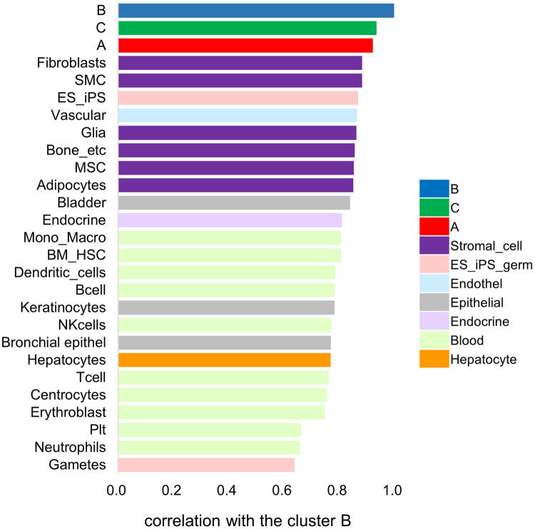
Fig 5. Comparison of the vector values of the expression pattern for each cell type.
The graph of vector values shows primary cells that resemble cluster B cell lines. The color of columns for each cell corresponds to the cell category, same as in Fig 4.

