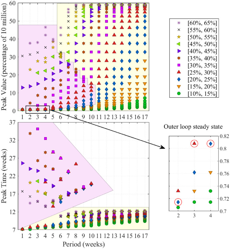
Fig 4. Full in depth analysis of infection over time as a function of FPSP duty-cycle and period and outer loop driven equilibria.
Analogously to the instances shown in Fig 3, in all diagrams showing peak-values and peak-times, each point corresponds to a single policy and all policies have a period which is a multiple of seven days. Markers/colours distinguish duty-cycles (e.g., blue diamonds in bottom diagrams denote policies with a duty-cycle between 20% and 25%) as seen in the top-right panel. (Top-Left) Shows that infected peak-values increase with duty-cycle for fixed period lengths and, notably, with increased period length for fixed duty-cycles. (Bottom-Left) shows that peak-times are small for policies attaining small and large peak values, while they are inversely related to the peak values for policies attaining middle peak values. Two distinct groups of policies, clustered on the basis of their peak-time behaviour, are highlighted in matching coloured regions in the (Top-Left) and (Bottom-Left) diagrams. (Bottom-right) highlights the duty-cycles to which the outer loop converges. Notably, these policies lie in the region of smallest peak-value (also, see Fig 5).

