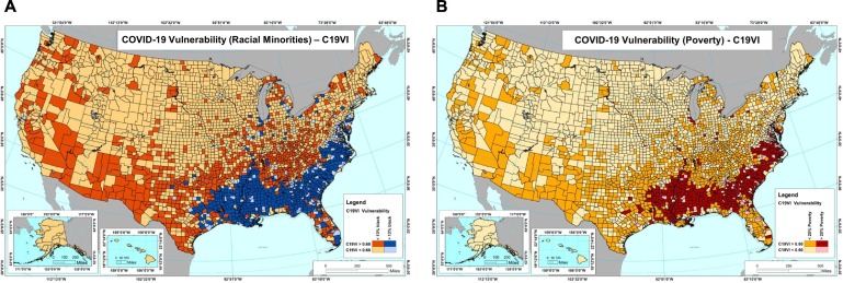
Fig. 9.
C19VI facilitated community-specific vulnerability assessment. C19VI of all US counties was overlaid with racial minority population percentage data and poverty percentage data to generate panel A and B, respectively. (A) Map of the US counties showing COVID-19 vulnerability of the racial minorities. The map shows counties with high vulnerability (C19VI > 0.6) and higher than 13% racial minorities in cobalt, low vulnerability (C19VI < 0.6) and higher than 13% racial minorities in tropical blue, high vulnerability (C19VI > 0.6) and lower than 13% racial minorities in red, and low vulnerability (C19VI < 0.6) and lower than 13% racial minorities in chardonnay. (B) Map of the US counties showing COVID-19 vulnerability of the economically poor communities. The map shows counties with high vulnerability (C19VI > 0.6) and higher than 20% poverty in red, low vulnerability (C19VI < 0.6) and higher than 20% poverty in pink, high vulnerability (C19VI > 0.6) and lower than 20% racial minorities in orange, and low vulnerability (C19VI < 0.6) and lower than 20% poverty in chardonnay.

