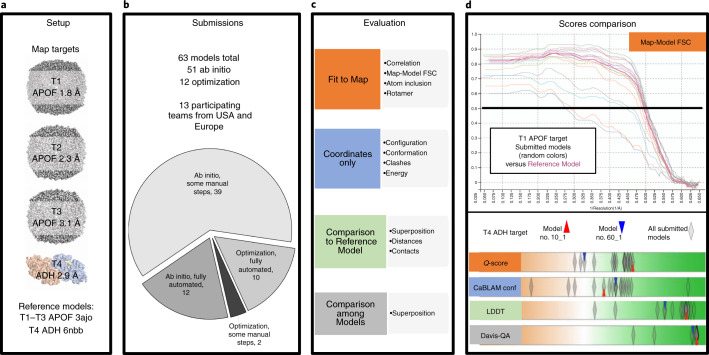
Fig. 3. Challenge pipeline.
a–c, Overview of the challenge setup (a), submissions (b) and evaluation (c) strategy. d, Scores comparison. Multiple interactive tabular and graphical displays enable comparative evaluations (model-compare.emdataresource.org). Top, Map-Model FSC curves, APOF 1.8 Å models (random light colors) versus reference model (bold cherry red). Map-Model FSC measures overall agreement of the experimental density map with a density map derived from the coordinate model (model map)12. Curves are calculated from Fourier coefficients of the two maps and plotted versus frequency (resolution−1). The resolution value corresponding to FSC = 0.5 (black horizontal line) is typically reported. Smaller values indicate better fit. Bottom, scores comparison tool, ADH models. Interactive score distribution sliders reveal at a glance how well submitted models performed relative to each other. Parallel lanes display score distributions for each evaluated metric in a manner conceptually similar to the graphical display for key metrics used in wwPDB validation reports4,32. Score distributions are shown for four representative metrics, one from each evaluation track. Model scores are plotted horizontally (semi-transparent diamonds) with color coding to indicate worse (left, orange) and better (right, green) values. Darker, opaque diamonds indicate multiple overlapping scores. Scores for two individual models are also highlighted: the interactive display enables individual models to be identified and compared (red and blue triangles).

