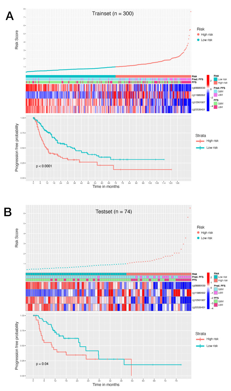
Figure 4.
(A): Survival analysis of 300 HCC trainset patients. (B): Survival analysis of 74 HCC testset patients. Top graph shows the patient risk score calculated by the signature, by stratifying patients in high risk of progression and low risk of progression. Middle heatmap shows the calculated risk contribution of each CpG; patients are ordered in accordance with risk score (color scale is Z-score of absolute risk values). Bottom plot shows Kaplan–Meier PFS curves for high risk and low risk patients.

