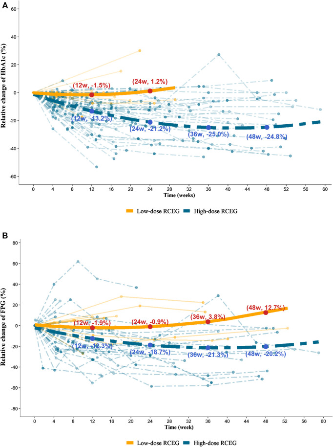
Figure 2.
Trajectory plots for the percentage of relative change in HbA1c (A) and FPG (B) in the high-dose and low-dose RCEG group. Data points presented in aquamarine belong to the high-dose group, and those in orange refer to the low-dose group. Each dashed and solid thin line represents the time-course of HbA1c and FPG changes for a patient in the high-dose and low-dose RCEG group, respectively. A multivariate nonlinear mixed-effects model was applied to acquire the dashed and solid thick lines, exhibiting the fitted mean profiles of patients treated with high-dose and low-dose RCEG, respectively. (A) The mean percentage change in HbA1c from baseline at 12, 24, 36, and 48 weeks in the high- and low-dose groups. (B) Relative changes in mean FPG at the same time points in both groups. FPG, fasting plasma glucose; HbA1c, glycated hemoglobin; RCEG, Rhizoma Coptidis extract granules.

