. 2021 Feb 8;129(2):027003. doi: 10.1289/EHP7425

Figure 2.

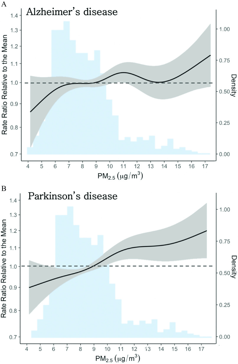
Figure 2(A) and 2(B) are two histograms and line graphs titled Alzheimer’s disease and Parkinson’s disease, respectively, plotting Rate Ratio Relative to the Mean, ranging from 0.7 to 1.4 in increments of 0.1 (left y-axis) and Density, ranging from 0.00 to 1.00 in increments of 0.25 (right y-axis) across fine particulate matter (micrograms per cubic meter), ranging from 4 to 17 in unit increments (x-axis). The line in both graphs is the exposure–response curve, the area near both the lines is the 95 percent confidence band and these bands correspond to the left y-axis, and both the histograms are the density histogram for fine particulate matter concentrations (right y-axis).

Nonlinear association between 1-y exposure to PM2.5 and first hospitalization for (A) Alzheimer’s disease (AD) and (B) Parkinson’s disease (PD) in New York State (2000–2014). The solid black lines are the exposure–response curves, as rate ratios relative to the mean PM2.5 concentration (8.1μg/m3), and gray shaded areas are the 95% confidence bands—both correspond to the left y-axis. The blue shaded area in both plots is the density histogram for PM2.5 concentrations (right y-axis). Sample sizes: NAD=264,076, NPD=121,982. Note: PM2.5, particulate matter 2.5μm in aerodynamic diameter (fine particulate matter).