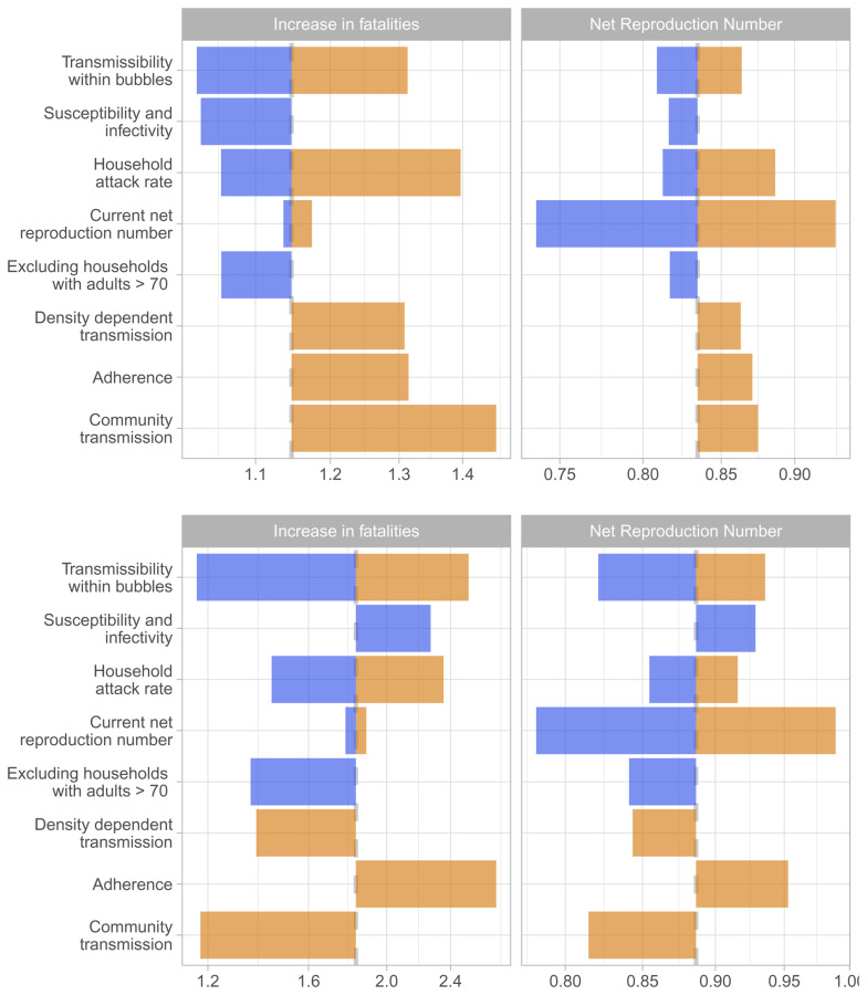
Figure 8. Sensitivity analyses.
The tornado diagram shows a univariate sensitivity analysis on the expected increase in fatalities and the net reproduction number for scenario 1 (above) i.e. allowing households with young children to pair up, and for scenario 3 (below), i.e. allowing single occupancy households to pair up. The color coding is based on factors determining higher risk (orange) and lower risk (blue) for Scenario 1. The base case estimate is indicated through the dashed grey vertical line. The sensitivity scenarios are (from top to bottom): transmission across individuals of households sharing a bubble is 90% or 0% lower than that within a household instead of 50%; the relative susceptibility to infection of children and older adults compared to adults is 79% and 125% while the relative transmissibility is 64% and 290%; the secondary attack rate in the household is 10% or 40% instead of 20%; R e is 0.7 or 0.9 instead of 0.8; that households including an adult over 70-years-old are excluded from forming bubbles; density-dependent transmission across close contacts instead of frequency-dependent transmission; that 50% of bubbles do not adhere to the recommendations but pair up with an additional household; and that the risk of a household to get infected from the community is proportional to the household size instead of being the same across households.

