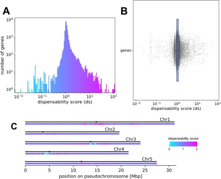
Fig. 2.
Distribution of the gene dispensability scores for Ath-966. a Histogram coloured according to the dispensability score. The x-axis represents the dispensability score and the y-axis shows the number of genes in each bin in logarithmic scale. b Box plot representing the dispensability score (x-axis) of all genes (y-axis). The mean is represented by the dashed blue line, the other blue line represents the median of the scores. c Genome-wide distribution of genes with different dispensability scores in A. thaliana Nd-1. The coloured heatmap shows the respective gene dispensability scores. There are low (blue) and high (pink) scoring genes clustered in repetitive regions, including centromeric and telomeric areas. The x-axis represents the size (in Mbp) of each pseudochromosome in the assembly. The black dots represent the position of the centromeres of the five chromosomes in the AthNd1_v2c assembly [19]

