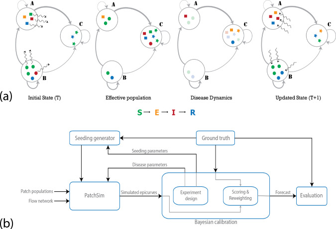
Fig. 2. Overall methodology.
a Stages in a single iteration of the metapopulation model: the large circles represent the patches in the simulation, and the gray edges represent the travel network, with varying thickness denoting heterogeneity in flow volumes. The sample population shows four individuals in patch A (squares), five in patch B (circles), and three in patch C (stars). The colors represent the disease state the individuals are in (susceptible, exposed, infected, or recovered). The wavy dashed arrows show movement of individuals (randomly chosen according to outgoing edge probabilities). In the first step, individuals are moved from their home patch to another patch (first panel), creating the effective population (second panel). The disease dynamics may include exposure events (transition from S–E), onset of infectiousness (E–I), and recovery events (I–R). The nodes undergoing these transitions are highlighted in the third panel, where we see an onset of infectiousness in patch A, two exposures and a recovery in patch C. Finally, the individuals return to their home patch (fourth panel). Note that, although for descriptive purposes we use individual agents above, the system is actually simulated deterministically using the mass-action principle. b Bayesian calibration framework: the calibration involves generating samples from the parameter space, evaluating the corresponding simulated epidemic curves in comparison to the ground truth. The appropriate reweighted epidemic curves are combined to provide the forecast. See Supplementary Methods for details on both the disease model and the calibration procedure.

