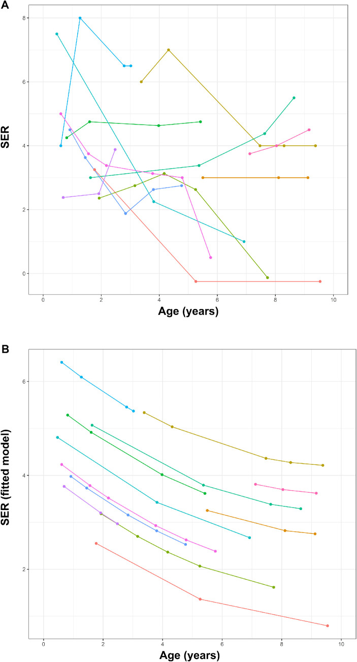
Figure 3.
Development of SER in individual patients is shown as (A) a conventional spaghetti plot and (B) after fitting our data to the nonlinear random regression model as proposed by Mutti et al.37 Different colors represent the individual patients.

