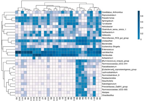
Figure 5.
Heat-map analysis of the 30 samples. A: test group; B: control group Heat-map showing the abundances of the top 30 genera was clustered and plotted using R software. Blue represents genera with higher abundances in the corresponding sample, and white represents genera with lower abundances.

