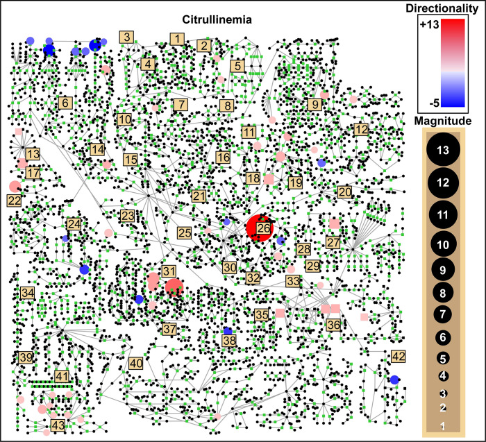
Fig 1. A comprehensive human metabolic pathway map with patient-specific metabolic perturbations overlaid.
Representative data are shown for plasma citrullinemia patient IEM_1023. Circular nodes are metabolites and are colored red if they were perturbed upwards, and blue if perturbed downwards. The diameter of the node reflects the magnitude of the perturbation. Beige squares refer to particular sub-pathways (see S1 Table) which are aligned according to a coordinate space curated by Metabolon (MetaboLync Pathway Visualizations software, version 1.1.2, Copyright 2014 Metabolon, Inc., Research Triangle Park, NC, USA).

