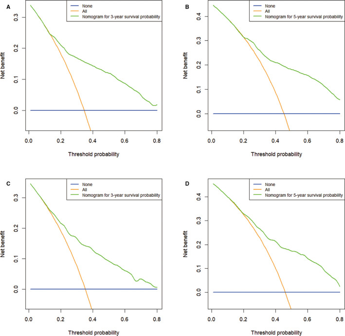
FIGURE 5.

Decision curve analysis of CSS‐associated nomogram. (A) DCA curve of 3‐year CSS in the training cohort; (B) DCA curve of 5‐year CSS in the training cohort; (C) DCA curve of 3‐year CSS in the validation cohort; (D) DCA curve of 5‐year CSS in the validation cohort. The blue line represents that no patients had cancer‐specific deaths, and the orange line represents that cancer‐specific death occurred in all patients. The green line represents the net benefit of using the nomogram in the prediction of survival. The x‐axis represents the threshold probabilities, and the y‐axis represents the net benefit. DCA, decision curve analysis; CSS, cancer‐specific survival
