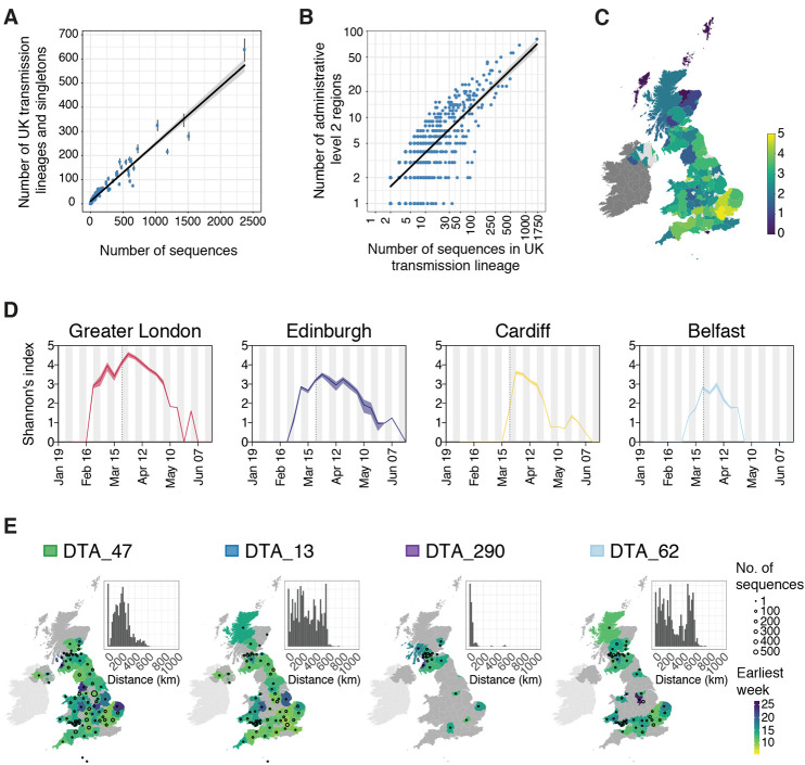
Fig. 4. Spatial distribution of UK transmission lineages.
(A) Correlation between the number of transmission lineages detected in each region (points = median values, bars = 95% HPD intervals) and the number of UK virus genomes from each region (Pearson’s r = 0.96, 95% CI = 0.95-0.98). (B) Correlation between the spatial range of each transmission lineage and the number of virus genomes it contains (Pearson’s r = 0.8, 95% CI = 0.78-0.82,) (C) Map showing Shannon’s index (SI) for each region, calculated across the study period (2nd Feb-26th Jun). Yellow colors indicate higher SI values and darker colors lower values. (D) SI through time for the UK national capital cities. The dotted lines indicate the start of the UK national lockdown. (E) Illustration of the diverse spatial range distributions of UK transmission lineages. Colors represent the week of the first detected genome in the transmission lineage in each location. Circles show the number of sampled genomes per location. Insets show the distribution of geographic distances for all sequence pairs within the lineage (see data S4 and fig. S12 for further details). Colored boxes next to lineage names are as depicted in Fig. 2D.

