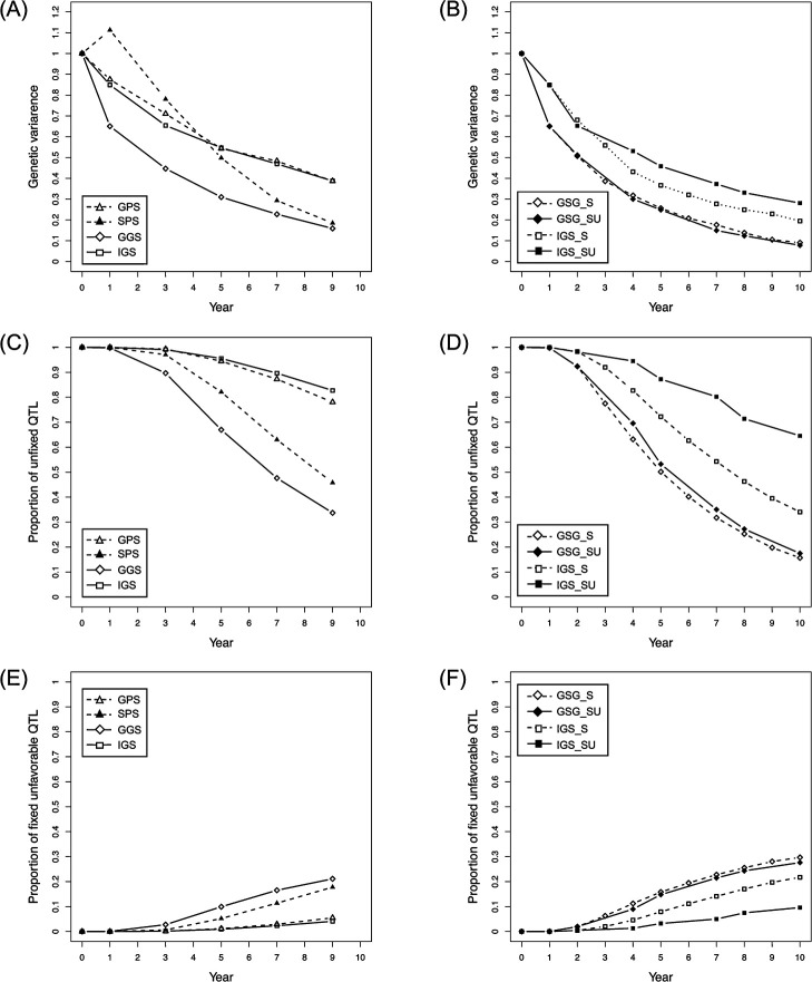
Fig. 3.
Comparison of genetic variation among the selection schemes. The panels indicate the changing pattern of genetic variance (A, B), proportion of unfixed QTLs (C, D), and proportion of fixed unfavorable QTLs (i.e., alleles with negative effects) (E, F) in each selection scheme, with the setting of 200 n, 100 QTLs, 500 markers, and h2 = 0.3.

