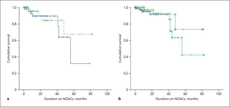
Fig. 3.
Kaplan-Meier curve for AF patients on a normal dose versus a reduced dose. a The black dashed line depicts the survival curve for patients on NOACs with a reduced dose while the green dashed line represents the survival curve for patients on a normal dose. There was a trend of higher survival for patients on a normal dose; however, it was not statistically significant (p = 0.579). b The green solid line depicts the survival curve for patients on NOACs who were incorrectly underdosed, while the blue dashed line represents the survival curve for patients on the correct dose. There was a trend of higher survival for correctly dosed patients; however, it was not statistically significant (p = 0.752).

