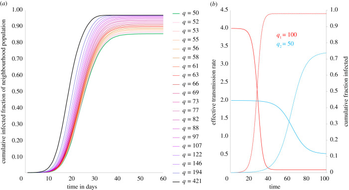
Figure 3.
Cumulative caseload simulation and analytical description. (a) Simulation of cumulative infected population fractions across neighbourhoods over time. Higher density neighbourhoods not only show earlier and steeper rise in caseloads but also end up with higher fractions of populations infected at the end of the epidemic. (b) Effective transmission rate (and cumulative fraction infected) over time. Analytical description of the evolution of effective transmission rates for neighbourhoods with different average contact rates (q). Denser neighbourhood is represented by q1 = 100 (red) and sparser neighbourhood by q2 = 50 (blue).

