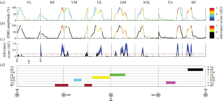
Figure 1.
Methodological overview and example results. Graphical overview of the post-LRP analyses for an example participant. Data for pedalling (day 1) start with the pedal on the top dead-centre. The x-axis ticks in (a–c) and the vertical dashed lines in (d) denote 25%, 50% and 75% of the pedalling cycle. Each box in (a–c) shows the data from the same cycle(s) but for each muscle. The line in (a) shows the normalized EMG patterns for all eight muscles from a single cycle during pedalling, with the colour scales representing the relevance score from the LRP analysis. Negative relevance scores were discarded by replacing them with zeros (b). In (c), the arbitrary threshold of 0.2 is shown as a red horizontal line and all the data above this threshold are coloured blue. Only the data points for which the relevance scores exceeded this threshold in all 30 cycles for a specific time point were used to create the signature map shown in (d) (discussed in §2.7). Here, each horizontal line corresponds to a muscle and each muscle is given a colour code that is shown on the right side of (d) (VL, vastus lateralis; RF, rectus femoris; VM, vastus medialis; GL, gastrocnemius lateralis; GM, gastrocnemius medialis; SOL, soleus; TA, tibialis anterior; BF, biceps femoris long head). For example, several cycles for the VM muscle correspond to data points that exceed the threshold (in blue; (c)) but it can be seen that this did not happen consistently in all 30 cycles and thus we did not consider it to be part of the participant's consistent muscle activation signature.

