. 2020 Dec 2;9:e61271. doi: 10.7554/eLife.61271

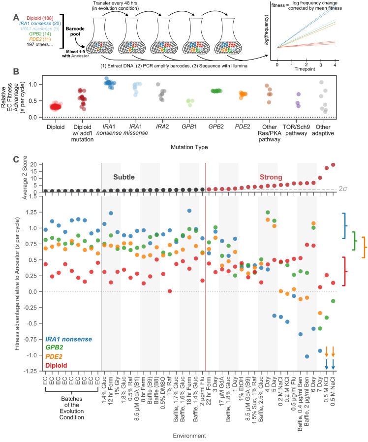
Figure 2. Measuring fitness for a collection of adaptive mutants across many environments reveals gene-by-environment interactions.

(A) Schematic of fitness measurement procedure. Adaptive mutants tagged with DNA barcodes are pooled at a 1:9 ratio with an ancestral reference strain. The pool is then propagated for several growth cycles, where the population is diluted into fresh media at fixed time intervals. DNA is extracted from each time-point, and the barcode region is PCR amplified and then sequenced. A mutant’s relative fitness is calculated based on the rate of change of its barcode’s frequency, corrected for the mean fitness of the population (see Materials and methods). Relative fitness is calculated in units of ‘per cycle’, representing the improvement of each barcode relative to the reference over the course of the time between transfers. (B) Fitness advantage of each mutant in the evolution condition relative to the ancestor. This fitness advantage is measured per transfer cycle and calculated as the average across all nine Evolution Condition (EC) batches. (C) (top) Environments are ordered from left to right depending on the degree to which they perturb mutant fitness from the average fitness observed across all EC batches. Environments in which average mutant fitness is within two standard deviations of average mutant fitness across EC batches are denoted in black and make up the subtle perturbation set. Environments in which aggregate mutant behavior exceeds two standard deviations are shown in red and make up the strong perturbations set. (bottom) This plot displays, for the four most common types of adaptive mutation observed in response to glucose limitation (Venkataram et al., 2016a), the average fitness in each of the 45 environments we study. Brackets on the right represent the amount of variation in fitness observed for each type of mutation across the EC batches, with the notch representing the mean and the arms representing two standard deviations on either side of the mean. For visualization purposes, we represent relative fitness values below −1.25 as arrows. Specifically, PDE2 mutants (orange arrows) have on average fitness −3.3 and −3.4 in 0.5 M KCl and 0.5 M NaCl, respectively. IRA1 nonsense mutants (blue arrows) have an average fitness −3.0 and −4.2 in 0.5 M KCl and 0.5 M NaCl, respectively.

Figure 2—source data 1. Fitness measurement data.
This table shows the fitness measurement data of each barcoded mutant in all the 45 environments. This includes the final fitness estimate for each environment (a weighted average of the replicates) as well as the fitness estimate in each replicate (e.g. denoted by ‘-R1’ to indicate replicate 1). The error for each fitness estimate is also included, in units of standard deviations. Mutants are classified by their putative causal mutation (see ‘Classifying mutations by mutation type’ in methods). Any additional mutations identified in Venkataram et al., 2016a are also listed.

Figure 2.

Figure 2—figure supplement 1. Noise model is a conservative measure of uncertainty.
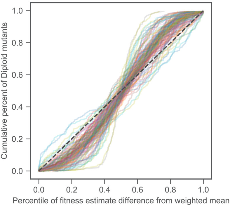
Figure 2—figure supplement 1.

Fitness differences among strains that are genetically identical and have very similar fitness effects tell us about the amount of measurement noise. Our strain collection includes 188 diploids that have similar fitnesses and possess no mutations other than diploidy. For each diploid fitness estimate, we calculated the percentile of deviation from the weighted average of all diploid fitness estimates in a particular environment. This is shown on the horizontal axis. The vertical axis shows the cumulative percent of diploids with deviations listed on the horizontal axis. If the noise model perfectly captures the uncertainty of each measurement, then it should be represented by the black dashed line, as, for instance, 20% of the diploids should have a difference from the mean in the 20th percentile. Each line represents a single experiment (we have 45 environments each with several replicates for a total of 109 experiments, see Materials and methods). For the vast majority of experiments, the diploids are closer to the mean than predicted by our noise model, as indicated by each line’s sigmoidal shape. This indicates that the noise model is conservative.
Figure 2—figure supplement 2. Replicates show consistent estimates of fitness.

Figure 2—figure supplement 2.

This plot is similar to Figure 2C except that it displays all replicate experiments separately. The four most common types of adaptive mutations observed in response to glucose limitation are indicated by color. The vertical axis displays the average fitness advantage of each mutation type relative to the ancestor. Replicates of the same environment are grouped by shading. For visualization purposes, we represent relative fitness values below −1.25 as arrows.