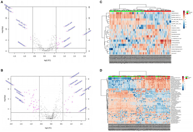
Figure 1.
(A,B) Volcano diagrams showing the changes in PTC and the most important metabolites of healthy subjects. (A) Represents the volcano map in positive ion mode, and (B) represents the volcano map in negative ion mode. The red dots in the figure represent differential metabolites, and the black dots represent no significant difference. The red dot on the right side of the figure represents the upregulated metabolite, and the red dot on the left side represents the downregulated metabolite. x-axis corresponds to log2 (fold change) and y-axis corresponds to –log10 (p-value). (C,D) Heatmap visualization of metabolomics data with hierarchical clustering analysis (HCA). (C) Represents the heatmap in positive ion mode, and (D) represents the heatmap in negative ion mode. The red color represents the peak value that is relatively large; the blue color represents the peak value that is relatively small; and the gray color represents the metabolite peak value of zero. The more similar the color, the more similar the peak value. The panel on the right represents the different metabolites. The upper dendritic structure is clustered according to the degree of metabolite similarity across samples. The red line below the dendritic structure represents the PTC group, and the green line represents the control group. PTC, papillary thyroid carcinoma; Control, healthy subject.

