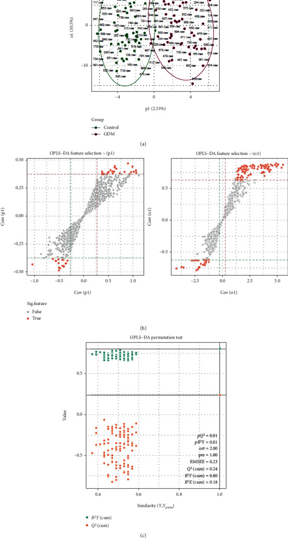
Figure 3.

Metabolite profile of the GDM group vs. the control group. (a) Score plot of the OPLS-DA model obtained from GDM and healthy subjects. Separation in X(p1) represents between group variation, and separation in Y(o1) represents within group variation. (b) The S-plot of OPLS-DA. (c) OPLS-DA permutation test at FDR 0.1 level.
